Header States
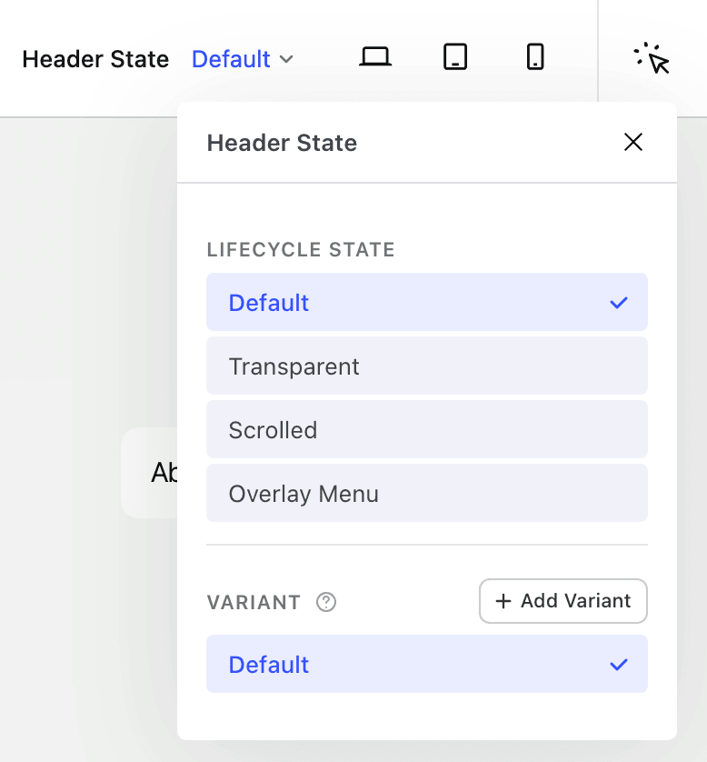
Inside a Header Navigation template, a single set of blocks can present a different appearance for each header state — so the header can restyle itself as the visitor scrolls or opens the menu, without duplicating any blocks. You edit the header once, give each state the styling you want, and Nectarblocks transitions between them automatically on the front end.
This is where Nectarblocks' stateful editing is used: you edit one block and give it a distinct appearance per state, with no cascade between states.
The states
- Default — the baseline appearance, used whenever no other state applies.
- Transparent — typically used when the header sits over a hero before the page is scrolled.
- Scrolled — the appearance after the visitor scrolls past the top of the page.
- Overlay Menu Opened — the appearance while an off-canvas / overlay menu is open.
Beyond these, you can define your own color variants for reusable, coordinated header color sets.
Editing a state
The Header State picker in the editor toolbar replaces the simple hover toggle you'd see elsewhere with the header's own states:
- Open the Header State picker and choose a state (for example, Scrolled).
- The canvas freezes the header in that state so you can see your changes as if the condition were active.
- Adjust any state-aware control. The value you set applies only to that state and overrides the Default value there.
- Switch back to Default to edit the baseline, or to another state to style it.
- Remove a per-state override with the reset icon next to the control's label.
When a control can be overridden in the current state, its label highlights so you know the value is state-aware.
Unlike the responsive waterfall (where desktop values flow down to tablet and mobile), a state value is simply set or not — when set, it applies in that state and overrides the Default value. There is no inheritance between states.
State-aware controls
A broad range of controls can be overridden per header state:
- Background Color and Text / Font Color
- Border and Border Radius
- Spacing (padding / margin)
- Size and Position
- Effects and Transform
- Images — swap an image per state, for example a different logo for the scrolled or transparent header
This lets a header genuinely re-lay-out between states — shrinking padding and swapping to a smaller logo on scroll, or flipping to light colors while transparent over a dark hero.
Color variants
Color variants are named, reusable sets of header colors (for example "Cream" or "Dark"). A variant overrides color attributes only — font, background, icon and dropdown colors — not layout, spacing or effects.
- Create a variant from the Header State picker by giving it a label. You can also assign it a preview background (light, dark or a custom color) so the editor canvas reflects how the variant will look.
- Apply a variant to a row using the variant picker in the Row block's settings.
- Variants are available across your pages, so individual pages can opt into a particular header look.
Related
- Header Builder — assemble and manage the Header Navigation template.
- Hover Mode — the other place stateful editing appears, for per-block hover styling outside the header.