Header Builder
The Header Builder is the experience of editing a Header Navigation template in the Theme Builder. Instead of a fixed set of header options, you assemble your header from blocks — giving you full control over its layout, content and styling, including how it looks before and after scrolling.
Replacing the classic header
When a Header Navigation template is assigned in the Theme Builder, it completely replaces the classic theme header. The header is now built entirely with blocks, and the classic navigation no longer renders.
The Theme Customizer reflects this. Its header sections show a "Header Builder Active" notice and only list the settings that still apply, such as header stickiness and the locations where the transparent header auto-activates. Everything else about the header is edited in the block editor.
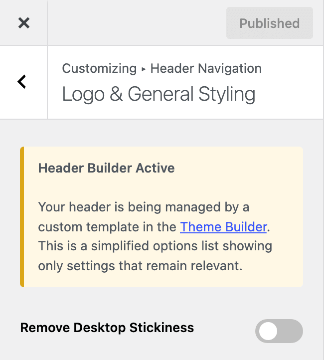
To bring the classic navigation back, delete the Header Navigation template or unassign it from the header navigation location in the Theme Builder. The classic header returns with the full set of Customizer options. Nothing is lost, so you can switch between the two at any time.
Creating a Header Navigation template
Start from the Theme Builder:
- In the WordPress admin, open Theme Builder.
- Click Add New Template to open the template chooser.
- Under the Navigation group, choose Header Navigation.
- Click Create Template.
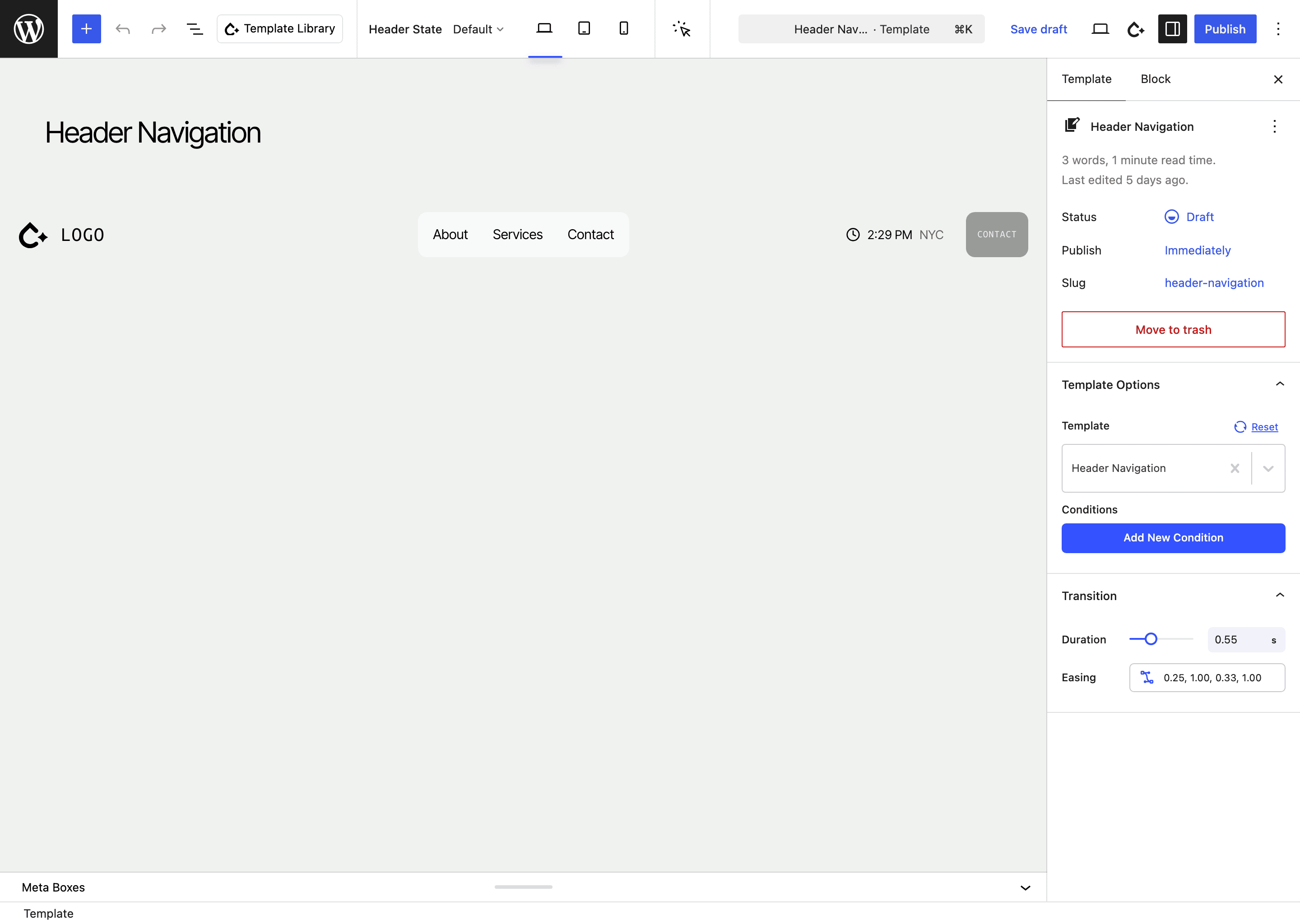
The template opens in the block editor pre-populated with a working default header, so you have a starting point rather than a blank canvas.
Prefer to start from a design? The Template Library includes a Navigation category with example header layouts you can insert and then adjust to your brand.
Composing the header
Assemble the header from the header blocks:
- Navigation — your menu, wrapping the core WordPress Navigation block. Add Megamenu blocks inside menu items for rich dropdowns.
- Header Actions — a container for your action icons: Search, a Header Account link, and the WooCommerce Mini Cart.
Standard layout blocks (Row, Column, Flex Box, Image for your logo, etc.) arrange everything.
Header states
A header often needs to look different depending on what the visitor is doing — sitting transparent over a hero, condensing once the page scrolls, or restyling while an overlay menu is open. The Header Builder handles this with four built-in states — Default, Transparent, Scrolled and Overlay Menu Opened — plus your own named color variants. You style each state once from the same blocks, and the header transitions between them automatically on the front end.
See Header States for the full editing workflow: the Header State picker, which controls can be overridden per state, and how color variants work.
Related
- Theme Builder — create and manage the Header Navigation template.
- Header blocks: Navigation, Megamenu, Header Actions, Search.