Variables
Variables are CSS variables for WordPress that you manage in the block editor, without writing code. Each one is a named size or shadow, such as Space M or Shadow L. Use it in any Nectarblocks block, change it in one place, and every block that uses it updates. Nectarblocks prints each variable as a CSS custom property, such as --nectar-space-m, so your own CSS can use it too. Every site starts with a set of core variables, and you can add your own.
A size works in most settings that take a length: spacing, widths and heights, gaps, border radius and width, font size and line height, positions, transforms and shadow offsets. A shadow holds one or more shadow layers.
Variables, theme.json Presets or Custom CSS
WordPress has two other ways to share a value between blocks. They differ in where the value lives and what the block settings do with it.
- theme.json presets come from the theme: the spacing scale and font sizes in its
theme.json, or in the Site Editor's Styles. Nectarblocks lists them in its spacing and font size settings. A preset holds one value, and it changes or goes away with the theme. See theme.json Presets. - Your own CSS custom properties, such as
:root { --card-gap: 2rem; }in the Customizer's Additional CSS, work asvar(--card-gap)in any setting that takes a custom value. Block settings don't list them, a different value per device needs media queries, and the blocks that use one lose the value when you remove it. - Variables are CSS custom properties you manage in the editor. A size can have its own desktop, tablet and mobile value, a shadow holds whole box-shadow layers, and every length setting lists them in its unit menu. Deleting one keeps its last value in the blocks that use it, or points them at another variable. They work with any theme.
How to Add a CSS Variable in WordPress
This example adds a size for the padding inside cards, then uses it in a block.
1. Open the Variables panel
In the block editor, click the Nectarblocks icon at the top right of the toolbar to open the Nectarblocks Settings sidebar, then expand Variables.
2. Add a size
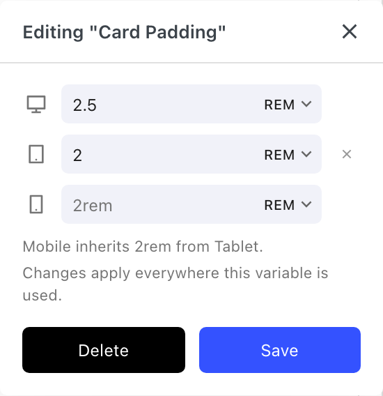
Click Add Size, type Card Padding and press Enter. In the editor that opens, set the desktop value to 2.5rem and the tablet value to 2rem. Leave mobile empty so it uses the tablet value, and click Save.
3. Use it in a block
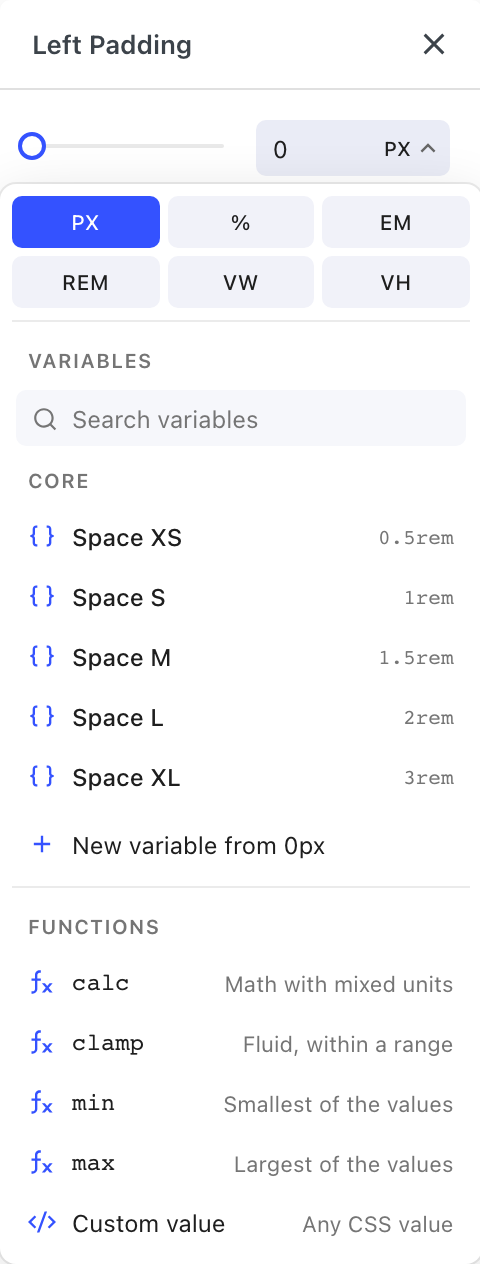
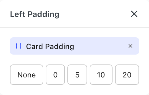
Select a block and open the Spacing setting on its Style tab. Click a padding side, click its unit (PX) and pick Card Padding from the Variables list. The side now shows the variable's name.
4. Change it in one place
Open Card Padding in the panel again and change its value. Every block that uses it updates, on every page.
The Variables panel
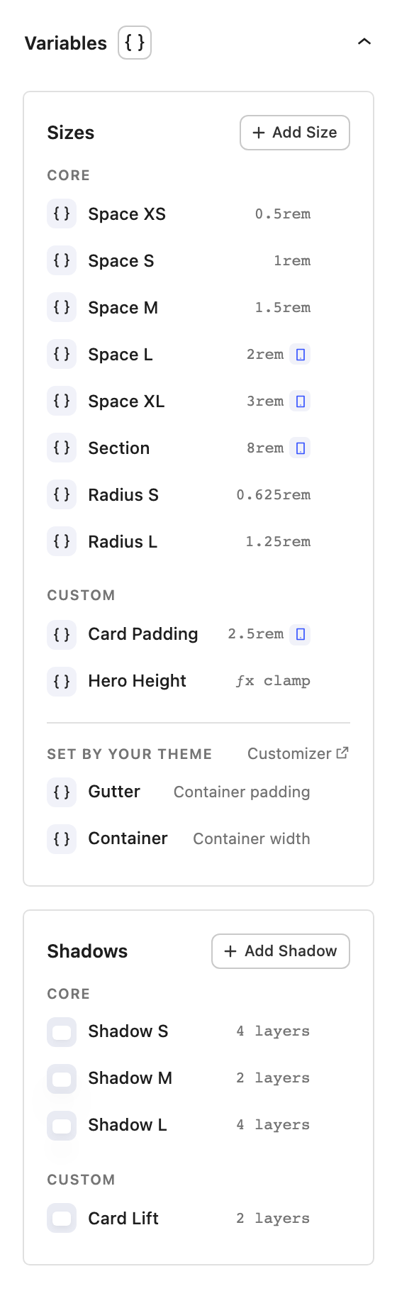
Open the Nectarblocks Settings sidebar in the editor and expand Variables, below Colors and Typography. The panel is shown to administrators, meaning users who can change site settings.
The panel has a Sizes section and a Shadows section. Each lists the core variables first, under Core, and your own variables after them, under Custom. Sizes ends with the two values your theme sets, under Set by your theme.
Core variables
Core variables are on every Nectarblocks site, with the same names, so templates and demos can use them and still follow the values you set for your site.
| Name | CSS variable | Desktop | Tablet | Mobile |
|---|---|---|---|---|
| Space XS | --nectar-space-xs | 0.5rem | ||
| Space S | --nectar-space-s | 1rem | ||
| Space M | --nectar-space-m | 1.5rem | ||
| Space L | --nectar-space-l | 2rem | 1.5rem | |
| Space XL | --nectar-space-xl | 3rem | 2.5rem | 2rem |
| Section | --nectar-section | 8rem | 6rem | 4rem |
| Gutter | --nectar-gutter | Container padding, set by your theme | ||
| Container | --nectar-container | Container width, set by your theme | ||
| Radius S | --nectar-radius-s | 0.625rem | ||
| Radius L | --nectar-radius-l | 1.25rem | ||
| Shadow S | --nectar-shadow-s | A small, soft shadow | ||
| Shadow M | --nectar-shadow-m | A medium shadow | ||
| Shadow L | --nectar-shadow-l | A large, wide shadow |
An empty tablet or mobile cell means that device uses the value of the next larger device. A shadow has one value for every device. Shadow S, M and L are the shadows the Box Shadow setting offered as its Small, Medium and Large presets.
Gutter and Container are the page container's padding and width, and your theme sets them, so content that uses them lines up with the rest of the page. The panel and the unit menu show their values as Container padding and Container width. In the panel they sit at the end of Sizes, under Set by your theme, with a link to the screen where your theme sets them when it has one: the Customizer with the Nectarblocks theme, or the Site Editor with a block theme. You can't edit or reset them in the panel. Change them in your theme instead:
- Gutter is the side padding of the page container, at every screen size and inside any block. With the Nectarblocks theme, it is the Container Side Padding setting in the Customizer, under General Settings → Styling, including its tablet and mobile values. Without those, at 1024px and below the container is 88% of the screen wide, so Gutter is 6% of the screen width, unless a full width header sets the padding with its Full Width Left/Right Padding. With a block theme that uses root padding aware alignments, as the default themes do, it is the padding under Styles → Layout in the Site Editor. With another theme, Gutter uses the root padding the theme sets, or 50px if it sets none, the same padding the Row block uses.
- Container is the width of the page content, for widths and max widths that line up with it. With the Nectarblocks theme, it is the Max Website Container Width setting in the same Customizer section. With a block theme, it is the content width under Styles → Layout in the Site Editor. With another theme, it is the width a contained Row uses: the content width the theme sets, or 1200px for a classic theme that sets none.
You can change the value of any other core variable, but not its name. Click its row, or choose Edit from its menu, to open the same editor your own sizes and shadows use. Every block that uses the variable updates. Once a value differs from its default, the row's menu has Reset to Default, which puts the default back.
Core variables can't be renamed, deleted or moved. To start a variable of your own from one, choose Duplicate from its menu (Gutter and Container don't have it).
Demos can set their own values for the core variables. A demo or export made with core variables replaces your core values with its own, and any core variable it doesn't change goes back to its default. Older files leave your core values as they are. A demo's spacing scale comes with its variables, and its container width and padding come with its theme settings, so Gutter and Container follow the demo through the theme. See Import and export.
Sizes
Click Add Size, type a name and press Enter. The size's editor opens with three rows, marked by a desktop, a tablet and a mobile icon:
- The desktop row is required.
- The tablet and mobile rows are optional. An empty row uses the value above it, shown in grey, with a line below the rows saying where it comes from, such as "Mobile inherits 80px from Tablet". Clear a row to send it back to inheriting.
A value can be a number with a unit, or any CSS value, including calc(), clamp(), min(), max() and other variables. A size can't refer back to itself, directly or through another variable. Click Save to apply your changes.
A row shows a warning when its size refers back to itself or uses a variable the site doesn't have, which an import can cause.
Shadows
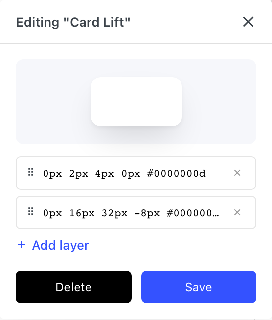
Click Add Shadow, name it, and edit its layers. Click a layer to set its position (outset or inset), X and Y offsets, blur, spread and color. The color can be a global color. You can add layers, drag them into order and remove them, as long as one is left. The preview at the top shows the result. Click Save to apply your changes.
Managing variables
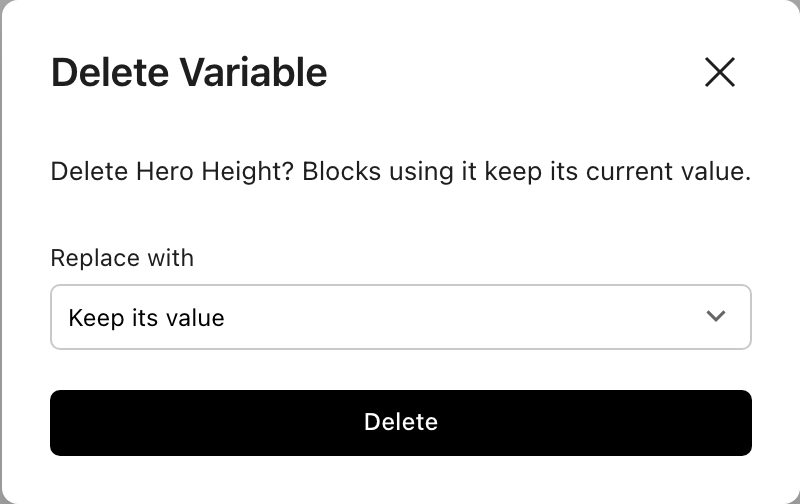
Click a row to open its editor. The editor of your own variables also has Delete. Gutter and Container have no editor, and their menu has only Copy CSS Variable. The menu of one of your own rows has Edit, Copy CSS Variable (to use the variable in your own CSS), Duplicate, Rename and Delete. A duplicated variable asks for a name first, then opens its editor. Drag your own rows to reorder them. Shift-click to select several of them, then choose Delete Selected from the menu of any selected row.
Deleting a variable doesn't change your pages. Blocks that use it keep its last value, and their settings show its name struck through. The delete dialog has a Replace with menu, which lists the core variables first. If you pick another variable of the same kind, those blocks follow it, and their settings show its name next to the struck-through one.
Using a size in a block
- Click the unit of a length setting, such as the PX on a padding side.
- Pick a variable from the Variables list, between the units and the functions. The core sizes come first. Once the list has more than eight variables, a search box appears.
- The setting now shows the variable's name. Click it to open the same menu. From there you can swap to another variable, pick a unit to go back to a number, or start a function. The × beside the name removes the variable from the setting. Where a setting is too narrow for the name, such as a padding side or a corner radius, a core space or radius size shows only its step, such as M for Space M. Hover it to see the full name.
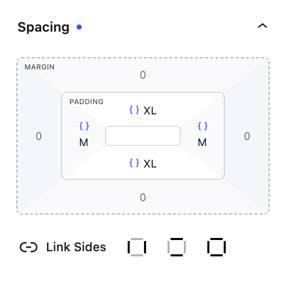
The core radius sizes are listed only in border radius settings, and Container only in width, minimum width and maximum width settings, so a block can line up with the page content. The other core sizes are listed in every setting but border radius. Your own sizes are listed in every length setting, and a variable's own editor lists every size it can use, the radius sizes included. A variable that can't work in the setting, such as a negative size in padding, is greyed out, with the reason shown on hover.
Administrators also get one more item in this menu. On a setting that holds a plain number, it is New variable from 24px (using the current value), or New variable when the field is empty, which starts at 16px. It asks for a name, creates the variable and switches the setting to it. On a setting that already uses a variable, it is Edit "Name"…, which opens that variable's editor next to the setting (except for Gutter and Container, which your theme sets). Changes apply everywhere the variable is used. To delete a variable, use the panel.
In the CSS function editor, a variable shows as a chip with its name, and the cursor moves over it as one unit. Typing part of a name suggests the variable, and the function search finds variables by name.
Using a shadow in a block
In the Box Shadow setting, click Shadows. The core shadows come first, then your own shadow variables. When both are listed, or Save current is shown, they sit under Core and Custom headings. The shadow the block is linked to is highlighted. Picking one replaces the block's current layers with a link to it, so editing the variable later updates the block.
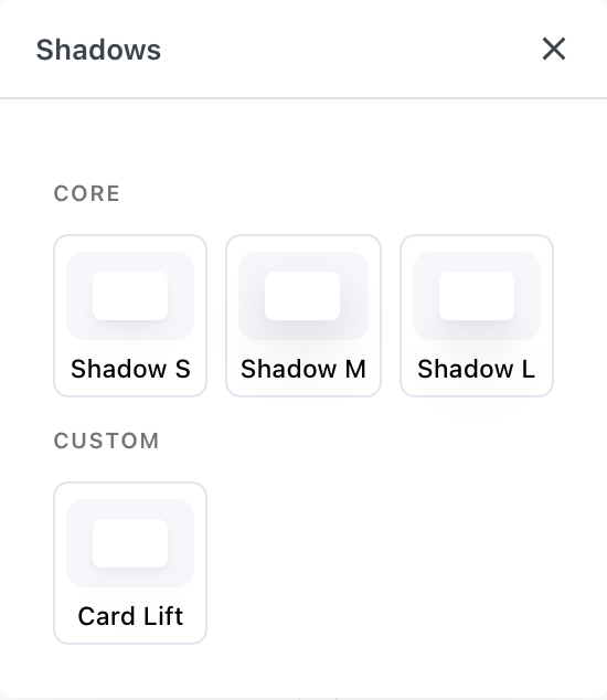
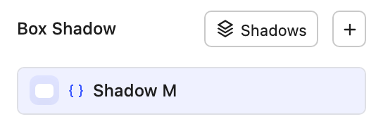
Click a linked shadow's row to swap it for another variable, edit it (administrators) or Detach it, which copies its layers into the block as plain layers. To start from a core shadow and change it for one block only, pick it and then Detach it. Save current is a button in the Shadows popover, shown to administrators when the block has shadow layers and none of them is linked. It asks for a name, saves the block's shadow as a new variable and links the block to it.
Using variables in your own CSS
Every variable is a CSS custom property on the page root and body, so any CSS on the page can use it. Core variables have the names in the table above, such as --nectar-space-m. Your own variables get a generated name, such as --nectar-gv-a1b2c3d4e5, so choose Copy CSS Variable from a row's menu to copy its var() reference.
.my-card {
  padding: var(--nectar-space-m);
  border-radius: var(--nectar-radius-l);
  box-shadow: var(--nectar-shadow-m);
}
A size's tablet and mobile values apply at the tablet and mobile breakpoints, so CSS that uses it follows them without media queries of its own.
To change a core variable's value from your own CSS, such as the Customizer's Additional CSS, set it on body, for example body { --nectar-space-m: 2rem; }. The variables are set on body as well as the page root, so a value set only on :root doesn't reach your blocks.
Import and export
The plugin export includes your variables and the core values you changed. Importing adds the file's variables and updates any with the same ID, without removing your other variables. When the file has core values, they replace yours, so a core variable the file leaves at its default goes back to its default. Files made before core variables leave yours as they are. Demos bring in their variables and core values the same way. Gutter and Container have no values in the file: they come from the theme settings, which a demo imports separately.
Limits
- Variables hold sizes and shadows. Number settings such as opacity and z-index can't use them yet.
- Settings that can't take CSS functions can't take variables either.
- Global Typography, the theme Customizer and core WordPress blocks don't use variables.
- A shadow picked in the Shadows popover is a link, core shadows included, and links need Nectarblocks 3.6.0 or later. Older versions drop these shadows from the page and show each link as a 0px layer in Box Shadow. To keep them, Detach them before going back to an older version.
- Content copied to another site points at variables that site doesn't have. Those settings show Missing variable in orange until you pick one of that site's variables. Core variables are on every site, so references to them keep working.