Video Lightbox

The Video Lightbox block allows you to add a dynamic visual element to your page. This block opens a video in a lightbox overlay when triggered and allows your audience to interact with your video content.
Sidebar Controls
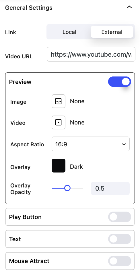
General settings
- Link Allows you to choose between a locally hosted video or an external link.
- Preview Select to add a preview image or video clip to your lightbox.
- Image Choose an image for your preview.
- Video Choose a video clip for your preview.
- Aspect Ratio Used to change the ratio of the video. This will determine the size of the video when displayed on the page.
- Overlay Allows you to overlay a color on your preview image or video.
- Overlay Opacity Choose the opacity of your overlay color.
- Play Button Select to add a play button to your image or video preview.
- Size Adjust the size of your play button.
- Roundness Select how round or square your play button is.
- Icon Choose the color of your icon.
- Icon Background Choose the color of your icon background.
- Text Select to add text with your play button.
- Flow Choose if your text is below or in line with your play button.
- Color Allows you to choose the color of your text.
- Style Select the style of your text.
- Mouse Attract Choose to have your play button follow the movement of your mouse.
- Type Select if the play button starts in the center of your preview or is hidden until your mouse hovers over the preview.

Block Controls Available
The following are common Nectar Block controls which are used in other blocks as well as the Video Lightbox block.
- Display
- Background
- Border
- Size
- Position
- Spacing
- Link
- Effects / Transform
- Animations