Table of Contents

The Table of Contents block automatically builds a navigation list from the headings on your page. As you add or edit headings, the list stays in sync, and visitors can click any entry to jump straight to that section.
Sidebar Controls
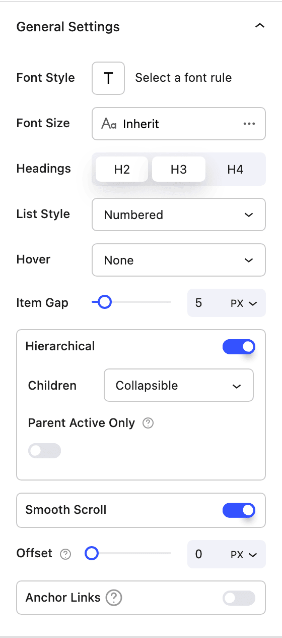
Layout
- Preset Choose a starting style:
Default(plain list) orCard(boxed, sticky layout with its own colors and padding). - Headings Select which heading levels to include (H2, H3, H4). Only the levels you enable appear in the list.
- List Style Show the list as
Numberedor withNone(no markers). - Hover Effect Add an optional
Bulletindicator that appears when an item is hovered, orNone. - Item Gap Control the spacing between each entry in the list.
- Hierarchical Nest sub-headings under their parents in a tree layout. When enabled, Children controls how nested items behave:
Collapsible(expand and collapse under their parent),Always Visible, orHidden(don't show nested items at all). Children visibility is responsive — set a different mode per breakpoint (tablet inherits desktop, mobile inherits tablet), so you can keep the full tree on desktop but switch toHiddenon mobile, for example. - Smooth Scroll Animate the scroll to the target heading instead of jumping instantly.
- Offset Add extra space above the target heading when scrolling, so it isn't hidden behind a sticky header.
- Anchor Links Show a copy-link icon next to each heading; clicking it copies the heading's anchor URL to the clipboard.
- Custom Labels Override the auto-detected text for any heading, so the entry in the list can differ from the heading itself.
Style
Styling is split into Items and Block tabs, each offering background color, text color, border, border radius and spacing. Items additionally expose Opacity and Active Opacity (the opacity of the entry currently in view).
How it works
On the front end the block scans the page for the heading levels you selected, assigns anchor IDs to any headings that don't already have one, and keeps the active entry highlighted as you scroll. When the list is sticky it tracks your scroll position; when hierarchical + collapsible is enabled, parent entries expand and collapse their children.
Block Controls Available
The following are common Nectar Block controls which are used in other blocks as well as the Table of Contents block.
- Typography
- Font Size
- Color
- Background
- Border
- Spacing
- Position
- Display
- Effects / Transform
- Animations