Navigation

The Nectar Navigation block extends the core WordPress Navigation block with a full design system for headers — typography, colors, spacing, borders, hover/active states, link animations, a custom overlay (mobile) menu and styled dropdowns. Inserting it drops in a core Navigation block flagged as Nectar-enhanced, so you keep all of core's menu management while gaining a complete sidebar of Nectar controls.
Sidebar Controls
The enhanced inspector is organized under a Nectarblocks panel with three top-level tabs: Menu Items, Overlay Menu and Dropdowns. Most settings are responsive and many support a hover state.
Header State badge
When the Navigation block lives inside the Header Navigation template part, a badge at the top of the panel shows which header state you're currently editing — Default, Transparent, Scrolled or Overlay Menu — and any active color variant. Every styling control on the panel can be overridden per state, with a reset action surfaced on each control to peel that override back to the base value.
Menu Items
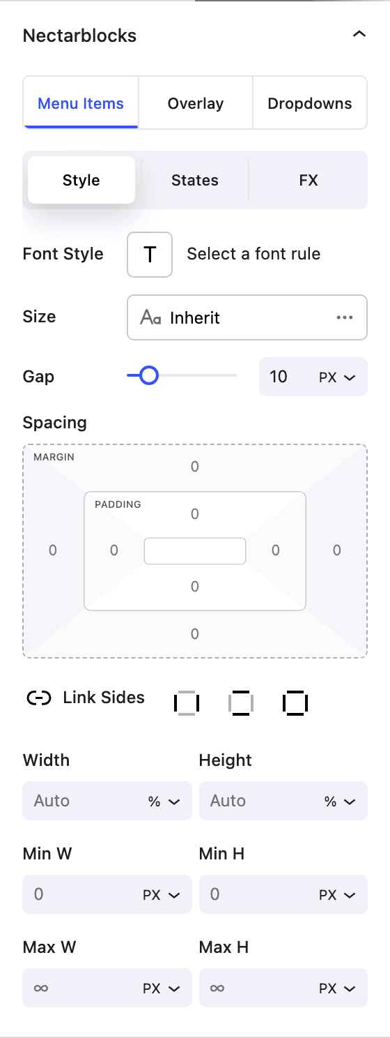
The top-level menu links. Split into three sub-tabs: Style, States and FX.
Style
- Typography Apply a typography preset to the menu links.
- Font Settings Responsive font size, weight, alignment, etc.
- Gap Horizontal spacing between menu items (0–50, in
pxorem). - Spacing Padding/margin around each link (responsive, with hover).
- Size Standard Nectar size controls for the menu container.
States
Two nested tabs: Default and Active (applied to the current menu item).
- Color Link text color (responsive, hover).
- BG Color Link background color (solid, responsive, hover).
- Border and Border Radius for the link. On the Active tab, both have an inherit from default toggle so the active link can either match the default style or use its own.
FX
- Animation Link hover animation:
Default,Reveal,Underline,Underline AltorWave. - Effects Standard Nectar effects controls (opacity, blur, etc.).
- Transform Standard Nectar transform controls (translate, rotate, scale, skew).
Overlay Menu
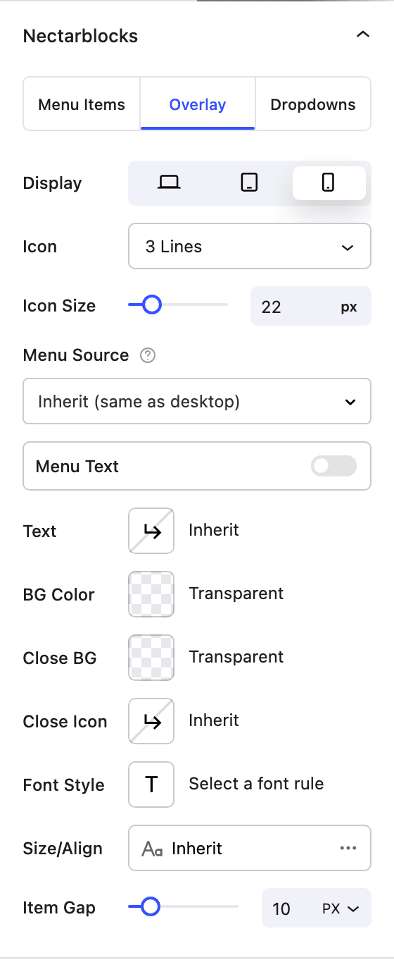
Replaces core's responsive overlay with a Nectar-styled mobile/overlay menu and a custom trigger.
- Display Choose which device sizes use the overlay (Desktop / Tablet / Mobile).
- Icon Trigger style:
3 Lines,2 LinesorText Only. SelectingText Onlyautomatically enables Menu Text. - Icon Size Trigger size (10–60px, responsive).
- Menu Source Controls which menu the overlay displays. Defaults to Inherit (reuse the desktop menu); you can also pick any Block or Classic WordPress menu from the dropdown. For fully custom designs, assign a template to the Off-Canvas Menu location in Theme Builder — this unlocks full control over the overlay's layout and contents.
- Menu Text (toggle) Add a text label next to or in place of the icon.
- Text The label text.
- Alignment
LeftorRightof the icon (hidden when the icon is Text Only).
- Text Color of the overlay menu links (responsive, hover).
- BG Color Background of the overlay panel (solid, responsive, hover).
- Close BG Background of the close button.
- Close Icon Color of the close icon.
- Font Style Typography preset applied to overlay menu links.
- Size/Align Responsive font size and alignment for overlay menu links.
When a menu has nested submenus, the overlay presents them as drilldown sub-panes: tapping a parent item slides in a new pane with its children (and a back control to return), keeping deep menus tidy on small screens rather than stacking everything inline.
The overlay's entrance animation isn't set on the block — it's controlled globally from the Theme Customizer under Layout → Header Navigation → Header Off-Canvas Menu.
Dropdowns
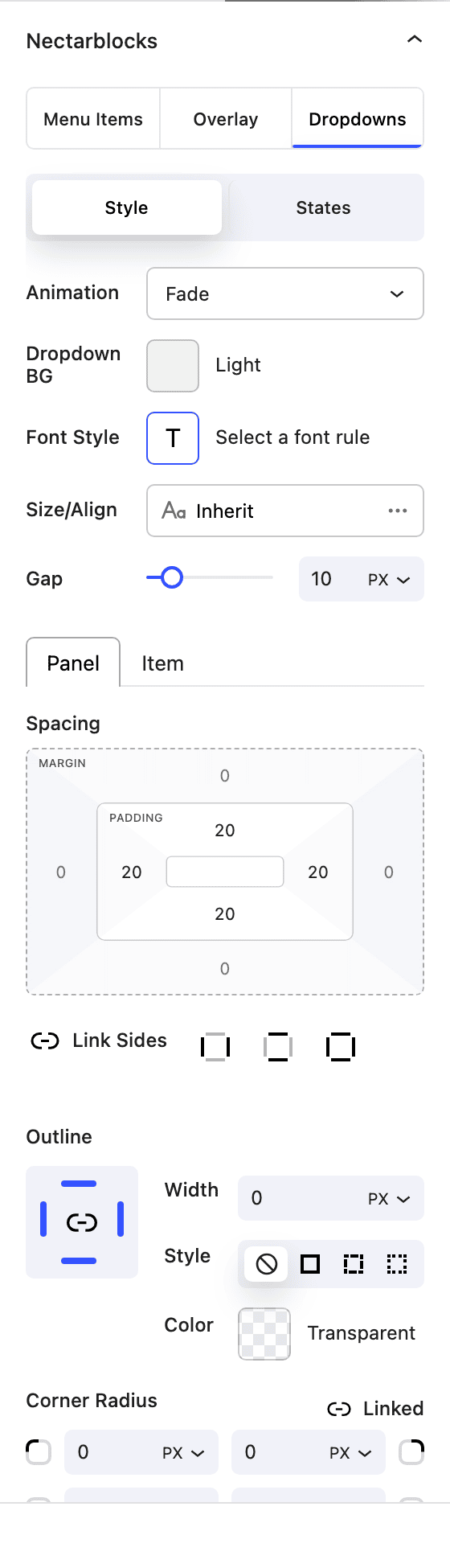
Styles the submenu panels that open from any menu item. Split into Style and States sub-tabs.
Style
- Animation How dropdowns open:
FadeorMorph. - Dropdown BG Background of the dropdown panel (solid, responsive, hover).
- Font Style Typography preset for dropdown links.
- Size/Align Responsive font size and alignment for dropdown links.
- Gap Spacing between items inside the dropdown (0–50, in
pxorem). - Spacing Two nested tabs:
- Panel — padding/margin around the dropdown panel itself (defaults to 20px on each side).
- Item — padding/margin around each dropdown link.
- Border and Border Radius for the dropdown panel.
States
Two nested tabs: Default and Active (current submenu item).
- Color Dropdown link text color (responsive, hover).
- BG Color Dropdown link background color (solid, responsive, hover).
Working with menus
The block still uses the core WordPress Navigation block underneath, so menu structure is managed in the usual way — pick or create a menu, then add, reorder and nest items from the canvas. To turn a menu item's dropdown into a rich content panel, nest a Megamenu block inside that item's submenu.
How it works
The block opts each core Navigation block in to Nectar enhancement by setting an internal marker on the block. Every Nectar control above writes to attributes that are scoped per-block (via a generated blockId) and compiled to CSS that's emitted on both the editor and the front end, so what you see in the editor matches what ships. When the block sits inside the header template part, the same controls can write per-state overrides so the navigation can restyle itself as the header transitions between transparent, scrolled and overlay-open states without duplicating the markup.
Related
- Megamenu — turn a menu item's dropdown into a full-width content panel.
- Header Actions — group search, account and cart icons alongside your navigation.