Loop

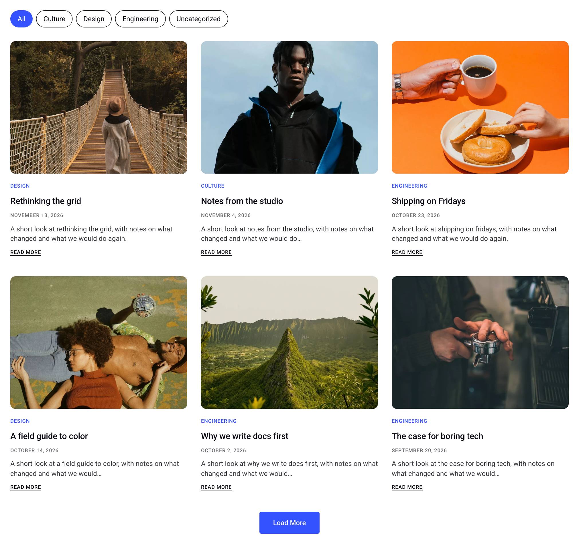
The Loop block shows a list of posts, pages or any custom post type in the WordPress block editor. You build one card from ordinary blocks, such as Text, Image and Button, and connect them to the post's data. The Loop then repeats that card once for every post its query returns, in the arrangement you choose: an even grid, a list of rows, a carousel, masonry and a few more.
Loop, Post Grid or the WordPress Query Loop
All three blocks list posts. They differ in how much of each item you control and what the list can do.
- Post Grid builds each item for you. You pick the parts to show (title, date, excerpt and so on) and a layout preset in the sidebar. It is the faster choice when one of its layouts fits.
- Loop lets you design the item yourself. The card can hold any block, in any structure, with its own spacing, colors, animations and interactions. Use it when you want a card that Post Grid's presets can't produce.
- Query Loop is the block that comes with WordPress. It repeats a Post Template of blocks for each post, in a list or a grid, and dynamic data works inside it. The Loop block covers the same ground and adds carousel, masonry and other arrangements, a Load More button, and filters for visitors through the Loop Filter block.
How to Build a Custom Post Loop
This example builds a blog section that shows the six latest posts in three columns, with a Load More button below them.
1. Add the block and choose a starting card
Add the Loop block from the block inserter. An empty Loop asks you to choose a starting card:
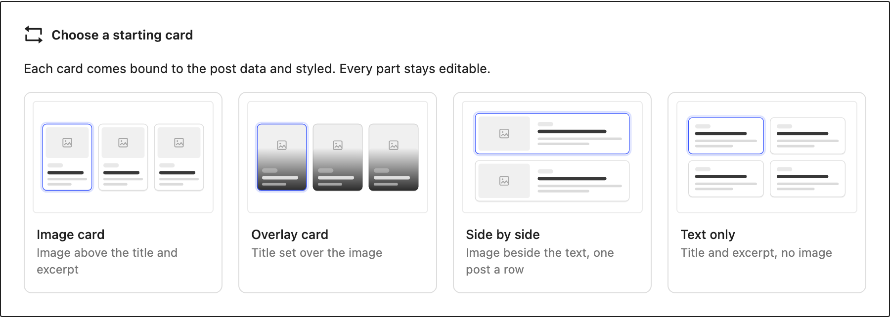
- Image card: the featured image above the categories, title, date, excerpt and a Read More link.
- Overlay card: the title set over the featured image.
- Side by side: the image beside the text, one post per row.
- Text only: the title and excerpt, without an image.
Each starting card is already connected to the post's data and styled. It is only a starting point: every part of it is a normal block that you can change, move or delete. For this example, choose Image card.
2. Choose the posts
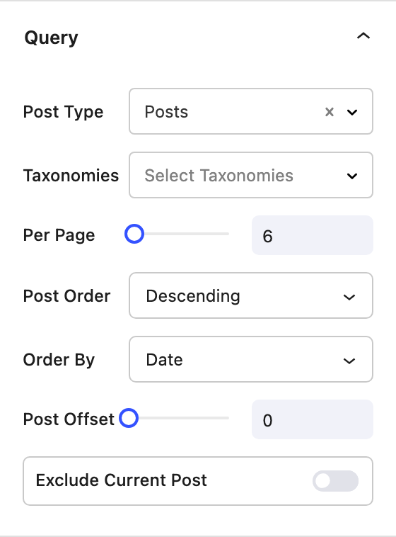
Select the Loop block. The Query panel decides which posts the Loop shows. Leave Post Type on Posts and Per Page on 6. The other query settings are described below.
3. Arrange the cards
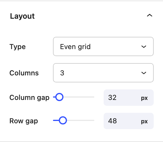
In the Layout panel, leave Type on Even grid and Columns on 3. The Image card sets 3 columns on desktop, 2 on tablet and 1 on mobile. To change the tablet or mobile value, switch the device preview in the editor toolbar and set Columns again. See Responsive Editing.
4. Edit the card
The first card on the canvas is the one you edit. The others are previews of the same card, each filled in with its own post. Select any block in the card and change it as you normally would. For example, select the title and pick another Font Style. Every card updates at once.
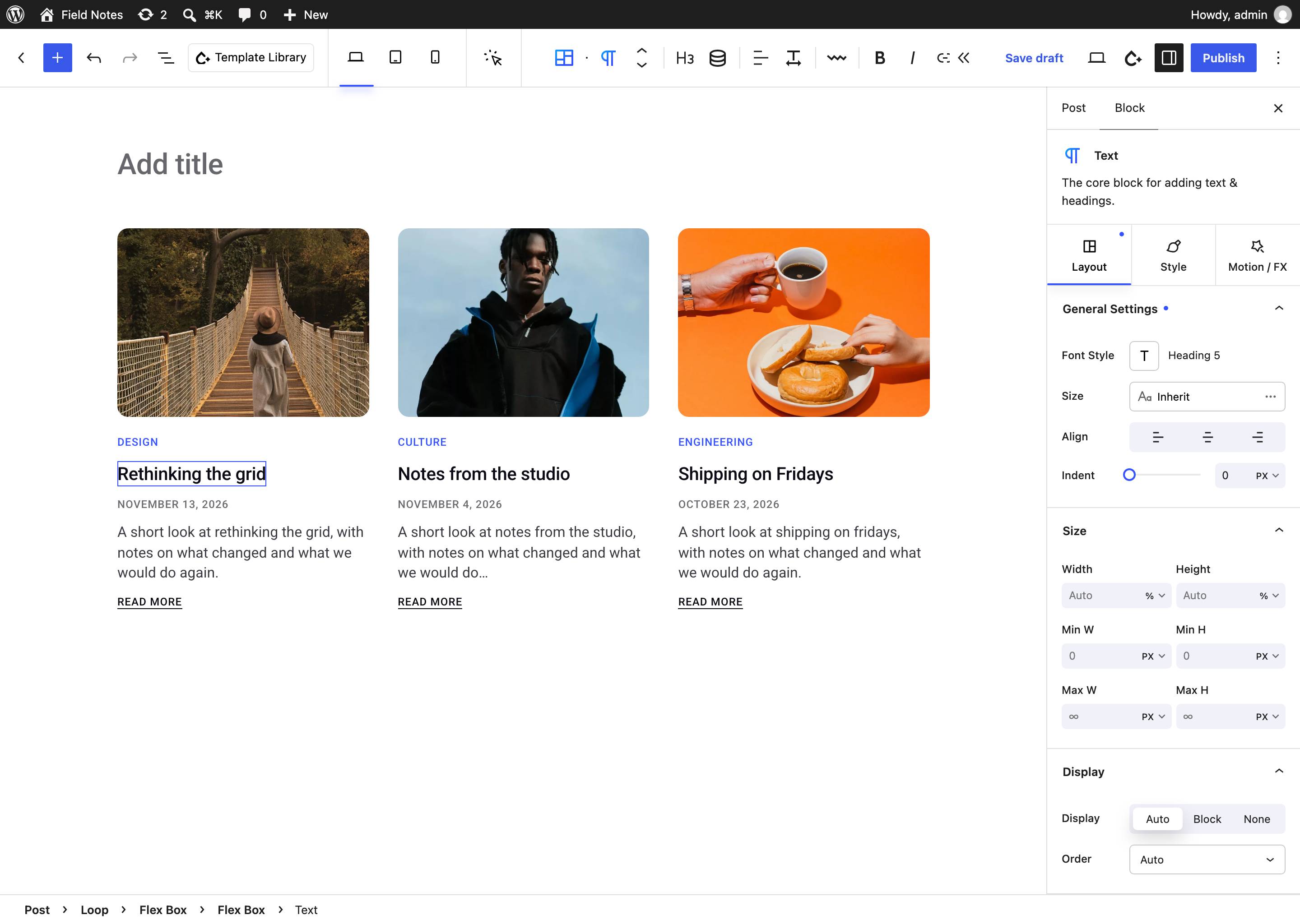
To edit the card while looking at another post, click that post's card. It becomes the editable card and the first one turns into a preview. The changes still apply to every card.
5. Add pagination
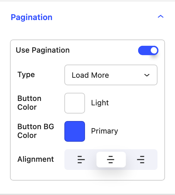
Open the Pagination panel and turn on Use Pagination. Leave Type on Load More. The button loads the next six posts below the ones already shown.
6. Publish
Publish the page. The Loop renders on the server, so the posts are part of the page's HTML.
To let visitors filter the posts by category, add a Loop Filter above the Loop.
Designing the card
The card is the Loop's inner blocks, so you build it the way you build any other part of a page. Add blocks with the inserter, drag them around, and style them with their usual settings.
Connecting the card to the post
A block in the card shows the data of the post it is repeated for when its content comes from a Current Post dynamic data field. The starting cards use these fields already. To connect a block you added yourself:
- For text, click the Dynamic Data icon in the Text block's toolbar and choose a field, such as Post Title, Post Date, Post Excerpt, Read Time or a Custom Field. Post date fields have a Date format setting.
- For images, choose Featured Image URL as the image's dynamic source. Background images on Rows, Columns and Flex Boxes can use it too.
- For links, set a button's or a block's link to the Post URL so the card leads to the post.
- To show the post's categories or tags, add a Taxonomy Terms block. Its First Term Only setting keeps the card to a single category label.
See Data Types for every field and where it can be used.
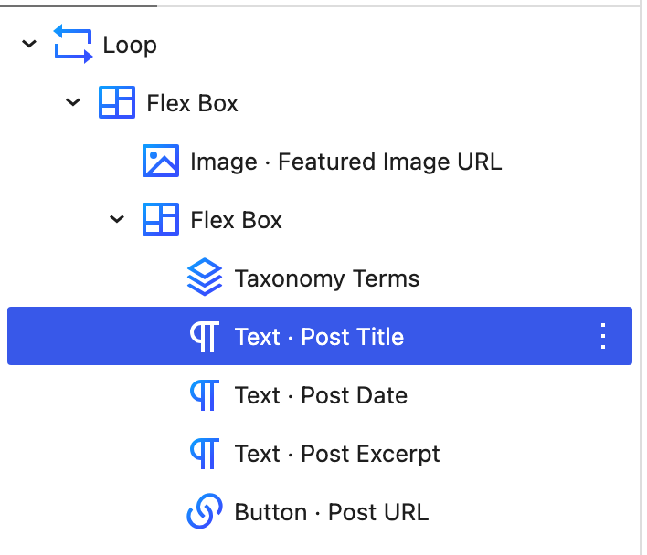
List View shows which field each block reads. In the starting Image card, the title reads Text · Post Title and the button reads Button · Post URL.
Effects inside the card
Interactions, animations, hover effects, carousels, galleries, tabs and accordions inside the card run separately in each item. Hovering one card only plays that card's hover effect. Loops explains how element IDs and dynamic backgrounds work when the same blocks repeat.
Using the same card in several Loops
To share one card design between Loops, select the card's outer block and turn it into a synced pattern. Insert that pattern into the other Loops. Editing the pattern updates the card in every Loop that uses it.
Settings
The Loop's settings are all in one tab. The card's own look is set on the blocks inside it.
Query
- Post Type The post type the Loop lists, such as Posts, Pages, Portfolio or a custom post type.
- Taxonomies Limit the Loop to posts in one or more terms, such as two categories. A post in any of the chosen terms is shown.
- Per Page How many posts the Loop shows at once. With pagination on, it is the number of posts per page.
- Post Order Descending (newest first when ordered by date) or Ascending.
- Order By The property to sort by, such as Date, Title, Modified or Menu Order.
- Post Offset Skip this many posts from the start of the results. For example, an offset of 1 leaves out the newest post when another section on the page already features it.
- Exclude Current Post On a single post template, leaves out the post the visitor is viewing, for a "More posts" section.
Layout
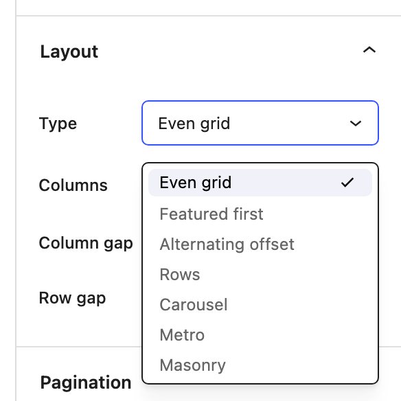
- Type How the cards are arranged:
- Even grid Equal columns and rows.
- Featured first The first post takes a larger spot at the start of the grid.
- Alternating offset Every other column sits lower than its neighbors, by the Offset amount.
- Rows One card per row, for lists.
- Carousel The cards scroll sideways. See Carousel.
- Metro A repeating pattern of wide and narrow cards, for up to 4 columns.
- Masonry Each card keeps its own height and the columns fill from top to bottom. Loading more posts can move the cards already shown, so Masonry works best with Numbered pagination.
- Columns The number of columns. Set it per device.
- Column gap and Row gap The space between the cards.
- Offset With Alternating offset, how far the lowered columns drop.
Carousel
With Type set to Carousel, the Layout panel shows:
- Slides per view How many cards fit in view at once, per device.
- Loop Starts again from the first card after the last one.
- Autoplay Moves to the next card on its own, every Autoplay delay milliseconds. Visitors get a pause control.
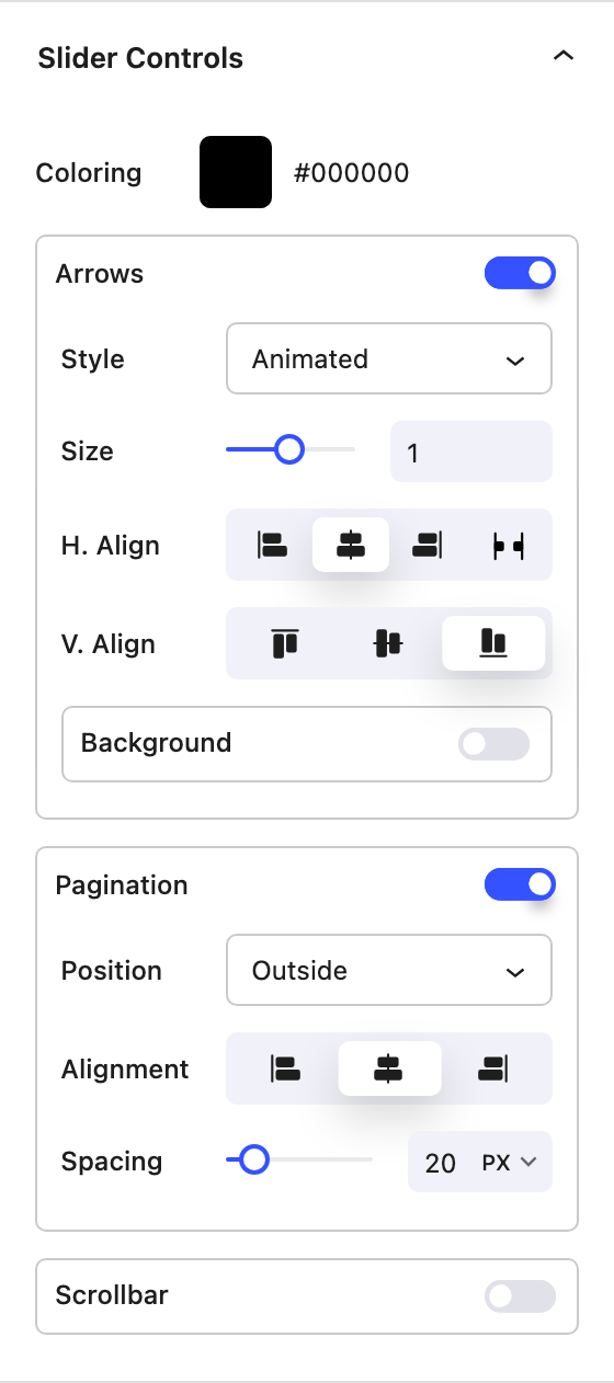
A Slider Controls panel takes the place of Pagination. It sets the arrows, the dots and an optional scrollbar, with the same options as the Carousel block. A carousel shows the number of posts set in Per Page and has no pagination. In the editor, the carousel scrolls so you can reach every card.
Pagination
- Use Pagination Splits the results into pages of Per Page posts.
- Type
- Load More A button that adds the next page of posts below the current ones.
- Numbered Page numbers below the Loop.
- Arrows Previous and next arrows.
- Button Color, Button BG Color and Alignment style the pagination.
New pages load into the Loop without reloading the rest of the page. Numbered and Arrows pages also get their own address, so a link to page 2 of a Loop opens page 2. Several paginated Loops on one page each keep their own page.
Loops in archive templates
Place a Loop in an archive template in the Theme Builder, such as the template for category archives, and it lists the posts of the archive being viewed. The Query panel says that its settings come from the archive. In an archive template:
- Pagination is always Numbered, and each page is a normal page load, as with the theme's own archives.
- A Loop Filter can't filter the Loop. The archive already decides which posts are shown.
When no posts match
If the query finds no posts, the editor shows "No posts match this query" in place of the cards, and the site shows "No posts found." You can still edit the card while the Loop is empty.
Loop templates in the Template Library
The Template Library has ready-made sections built with the Loop block. Open the library, choose the Blog category and search for Loop:
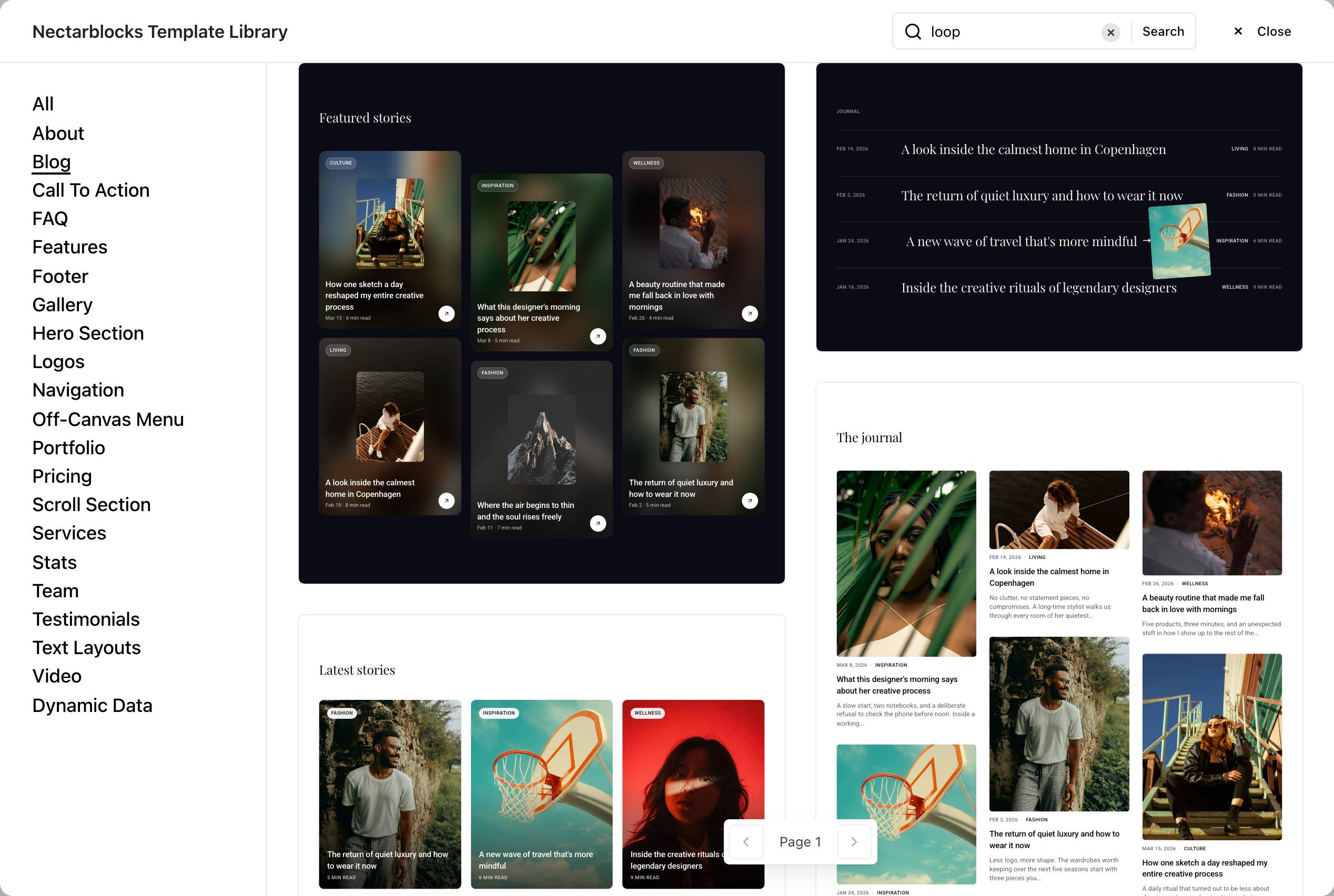
- Loop Featured Cards: the Alternating offset arrangement. Each card shows the post's image twice, blurred behind and sharp in a centered frame, with a category chip, title, date and read time. Hovering a card zooms the image and swaps its arrow. Six posts with Load More.
- Loop Editorial Index: a dark, text-first list in the Rows arrangement, with the date, a large title, and the category and read time. Hovering a row slides the title over and fades in the post's image.
- Loop Story Carousel: a carousel of portrait cards with the title and read time over the image. Three cards in view on desktop, two on tablet and one on phones.
- Loop Masonry Journal: a light, reading-first Masonry layout where each image keeps its own proportions. Nine posts with numbered pages. A post without a featured image becomes a text-only card.
The library previews fill these templates with sample posts. Once inserted, they show your own latest posts. Each one is a regular Loop, so you can change its query, arrangement and card like any Loop you build yourself.