Image Grid
A highly customizable Image Grid display that allows you to organize images using different layouts.
Sidebar Controls
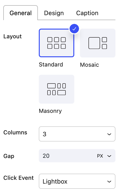
General Settings
- Layout Select between a Standard, Mosaic or Masonry grid.
- Columns The number of columns in your grid.
- Gap The gap between rows / columns of the grid.
- Click Event How the image grid will handle when the user clicks on the image.
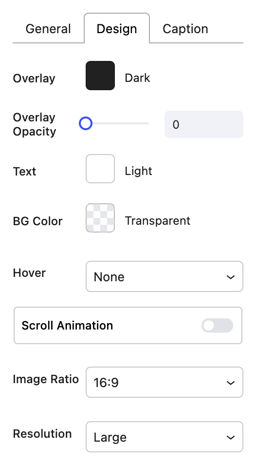
- Image Ratio The display ratio of the image in the grid.
- Resolution The media resolution for the image.

Design Settings
- Overlay
- Overlay Opacity
- Text Text colo
- Background Color
- Hover - Underline, Zoom or Zoom Underline
- Scroll Animation - This will animate the Post Grid when the user scrolls.
- Effect - Choose between Parallax and Zoom effects.
- Speed
- Trigger On On which device type the scroll animation should fire.
- Corner Radius - Corner Radius of the images.

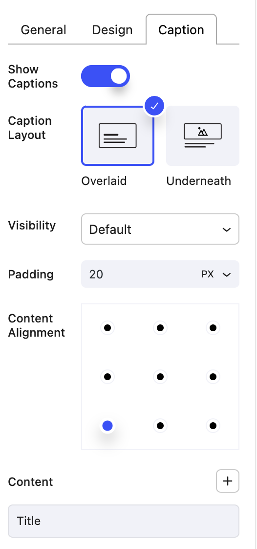
Caption Settings
- Show Captions - Hide or show Captions with your images.
_ Caption Layout
- Visibility
- Padding
- Content Alignment Choose how you would like to align the content.
- Content Choose the order, via drag and drop, and which items you would like displayed in the Post Grid item.
- Caption
- Meta Display
- Title

Block Controls Available
The following are common Nectar Block controls which are used in the Image Grid block.
- Border
- Background
- Spacing
- Sizing
- Display