Icon List

The Icon List block lets you build lists where each item has an icon and optional text. Use it for feature lists, checklists, steps, or any content that benefits from a repeated icon + line format. You add Icon List Item blocks inside the Icon List to define each row.
Adding items
Add blocks inside the Icon List using the block inserter: search for Icon List Item or use the Nectar category. Each Icon List Item can share the list’s default icon or use its own icon and styling.
Sidebar controls
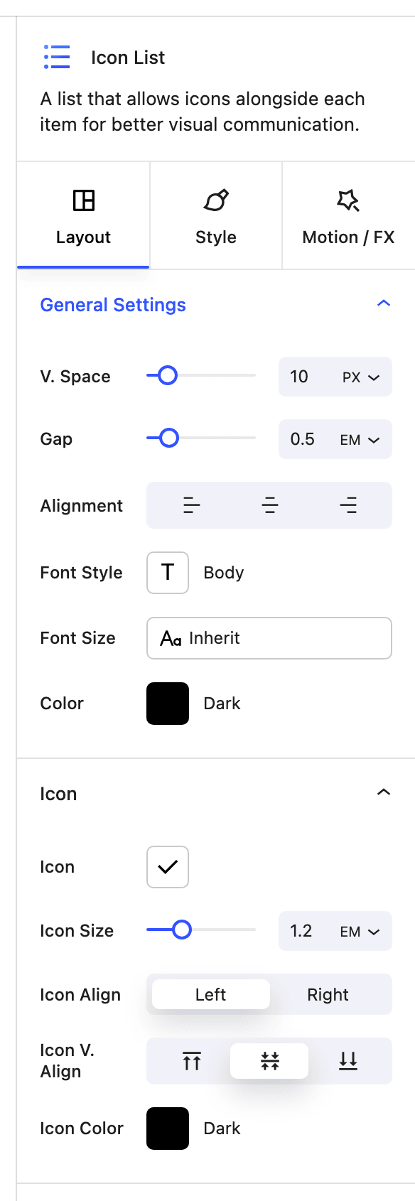
General settings (Icon List)
- V. Space Vertical spacing between list items (px or em).
- Gap Space between the icon and the text for each item (em).
- Alignment Horizontal alignment of the list content.
- Typography Choose a typography preset for the list text.
- Font Size Adjust font size (and line height where applicable).
- Font Color Set text color (solid or gradient), including responsive and hover.
Icon settings (Icon List)
- Icon Choose the default icon used for all items (individual items can override).
- Icon Size Size of the icon (em).
- Icon Align Horizontal alignment of the icon relative to the text.
- Icon V. Align Vertical alignment of the icon relative to the text.
- Icon Color Color for the icon, with responsive and hover support.
Icon List Item
Each Icon List Item has its own General and Icon settings so you can override the list default for that row (e.g. different icon or color per item).
Block controls available
These Nectar block controls are available on the Icon List block:
- Display
- Background
- Border
- Border Radius
- Position
- Spacing
- Effects / Transform
- Animations