Column

The Nectar Column block is a powerful tool for creating layouts. Columns are available to be nested inside of the Row block to create complex layouts. Columns can be resized and reordered on desktop, tablet, and mobile devices responsively.
Sidebar Controls
The following are controls unique to the Nectar Column block.
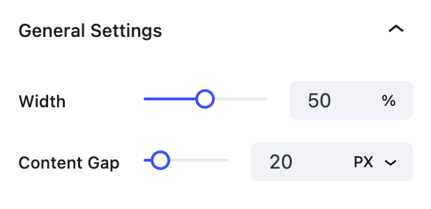
General settings
- Width Controls the width of the column.
- Content Gap Controls the gap between content inside the column.

Resizing Columns
Columns can be resized by dragging the column handle left or right, or by using the column width slider in the sidebar controls. Columns can be resized to any percentage width, or to a fraction of 12 columns depending on the value set on the parent Row Constraint setting.
Responsive Column Widths
Columns can be resized independently on desktop, tablet, and mobile devices. However, by default, columns stack vertically in the Tablet and Mobile viewports. To display your columns horizontally in either of these viewports, edit the parent Row block and set the Direction to Horizontal.
Block Controls Available
The following are common Nectar Block Controls which are used in other blocks as well as the Column block.
- Display
- Background
- Size
- Border
- Position
- Spacing
- Overflow
- Animations
- Effects / Transform