Carousel
Showcase your content in a dynamic and interactive format with the Carousel block. Effortlessly cycle through items with smooth horizontal scrolling, perfect for highlighting featured content, images, or testimonials.
Sidebar Controls
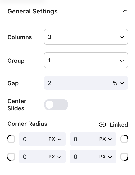
General settings
- Columns Allows you to choose the number of columns to display in the carousel.
- Group Determines the number of slides to move at a time.
- Gap Adjusts the space between each slide.
- Center Slide Centers the slides in the carousel.
- Corner Radius: Adjusts the corner radius of the carousel.

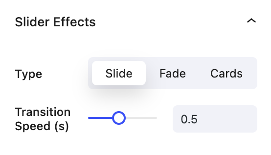
Slider Effects
- Type The type of effect to apply to the carousel.
Fade: The slides will fade in and out.Slide: The slides will slide in and out.Cards: The slides will appear as cards and overlap each other.
- Transitions Speed Adjusts the speed of the transition between slides.

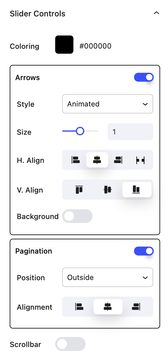
Slider Controls
- Coloring Adjusts the color of the navigation arrows and pagination dots.
- Arrows Displays the navigation arrows.
Style: Determines the style of the navigation arrows.Size: Determines the size of the navigation arrows.H. Align: Determines the horizontal alignment of the navigation arrows.V. Align: Determines the vertical alignment of the navigation arrows.Background: Adds a background color to the navigation arrows.
- Pagination Displays the pagination dots.
Position: Determines the position of the pagination dots.Alignment: Determines the alignment of the pagination dots.

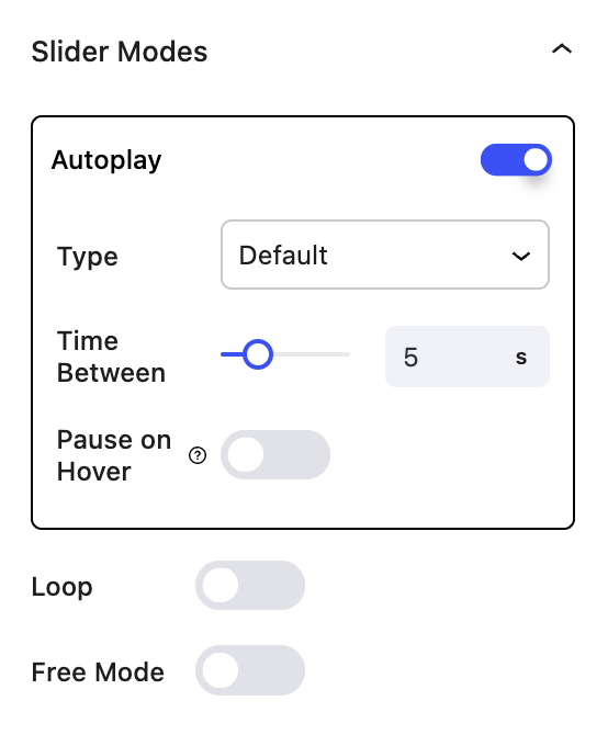
Slider Modes
- Autoplay Automatically cycles through the slides.
Type: Determines the type of autoplay.Time Between: Adjusts the time between each automatic slide change.Pause on Hover: Pauses the autoplay when the mouse hovers over the carousel.
- Loop Allows the carousel to loop infinitely.
- Free Mode Allows the carousel to be dragged and scrolled freely.

Block Controls Available
The following are common Nectar Block controls which are used in other blocks as well as the Carousel block.
- Size
- Display
- Background
- Spacing
- Position
- Overflow
- Animations
- Effects / Transform