Button

The Button Block is a versatile component that allows you to create attractive and interactive links to engage your audience.
Sidebar Controls
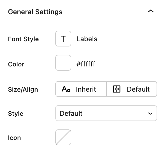
General settings
- Font Style The font style option allows you to choose from any of the font styles you have created in your Global Typography Font Rules.
- Color Allows you to choose the color of your text.
- Size/Align Any size specified here will override the size specified in your Global Typography Font Rules.
- Style Controls the style of the button.
Default: No additional styling.Arrow: Adds an arrow to the right of the button which will animate when hovered.Wave: The button will have a wave animation on the text when hovered over.Underline: The button will have an underline animation on the text when hovered over.
- Icon: Allows you to add an icon to the button. You can choose from any of the icons available the included libraries or upload your own.

Block Controls Available
The following are common Nectar Block controls which are used in other blocks as well as the Button block.
- Link
- Background
- Spacing
- Border
- Size
- Position
- Display
- Overflow
- Animations
- Effects / Transform