Interaction
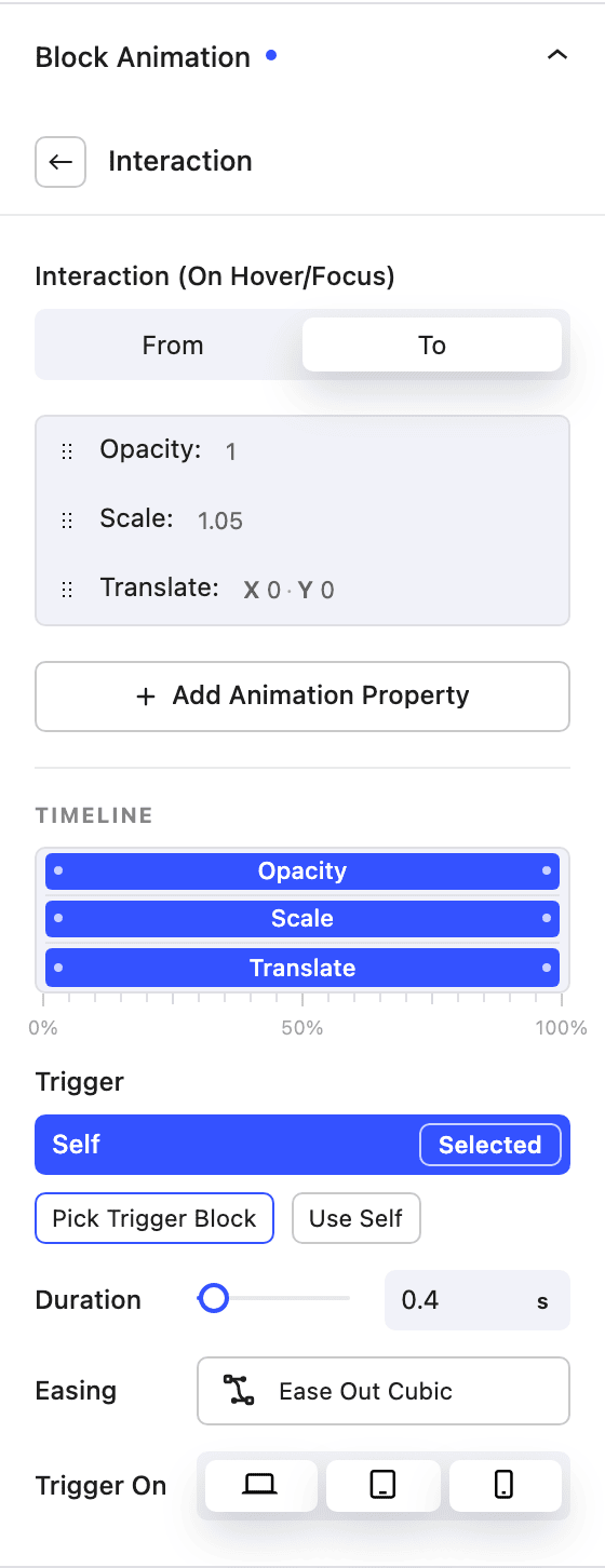
The Interaction trigger animates a block in response to a visitor hovering or focusing it — for buttons, cards, icons, images and any other block. Unlike the scroll triggers, an interaction animation plays forward on hover/focus and reverses when the pointer leaves.
Adding an Interaction animation
- Select the Nectar block you want to animate
- Open the Block Settings panel and scroll to "Block Animation"
- Click Add Animation Trigger
- Choose Interaction as the trigger type
- Add the properties you want to animate and set their From / To values
The interaction type is On Hover/Focus, so it also fires for keyboard users who tab to the element.
Trigger target — self or another block
By default an interaction animates the block it's attached to (Use Self). Switch the Trigger to Pick Trigger Block to animate this block when a different block is hovered — for example, hovering a card wrapper to animate an arrow icon inside it. Select the source block from the block tree.
Animation Properties
Click Add Animation Property and set a From and To value for each. The same property set as Scroll Position is available — Transforms (Translate, Scale, Rotate, Skew, Perspective), Width, Height, Opacity, Box Shadow, Color, Background Color, Filters and Masks.
- Duration — how long the hover animation takes (in seconds).
- Easing — a cubic-bézier preset or custom curve, or a Spring easing (Gentle, Wobbly, Stiff) for bouncy motion.
Per-Property Timing
Open a property's Timeline to give it its own Offset (0–100, when it starts) and Duration (1–100, how much of the interaction it occupies), so properties can cascade instead of all moving together.
Per-property timing is unavailable when Spring easing is selected — with a spring, all properties animate together.
Use Trigger On to choose which devices the interaction runs on. You can preview the hover state directly on the editor canvas while configuring it.